Slide Decks + Collateral
TunaTwinz.com
Slide Decks + Collateral

TunaTwinz.com
BRANDING │ ILLUSTRATION │ WEB DESIGN │ MERCHANDISE DESIGN
TunaTwinz is an Instagram account dedicated to reviewing tuna sandwiches (yup). In the wake of the COVID-19 pandemic, we wanted to be able to give back to the Washington, DC community while also providing merch for our fans and friends, donating 100% of profits to World Central Kitchen.
Brand development:
My process began with a simple, initial t-shirt design: a cheeky nod to our favorite fish and female anatomy. This illustration really was a starting point for the rest of the merchandise as an indicator of style and tone for the collection.


Defining our audience while also incorporating a giving aspect was the next step.
We singled out our target audience as young people, ages 16-35, who both are obsessed with food but have a sense of humor about the foodie world. We wanted to strike the balance between funny merchandise and a cause that we care about, all the while appealing to a broad audience across genders and personal styles.
Playful
Accessible
Funny
Unisex
Giving-centered
Self aware
BRAND KEYWORDS
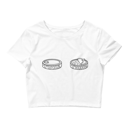
Next, we needed a logo that could both be used as an identifier and on merchandise. A driving force in our visual identity was the presence of hand-drawn wording and ever-so-imperfect illustrations. It felt more playful to adopt a simple, chunky illustrative style, easily recognizable as light-hearted. Initial sketches explored circular designs and eventually, the half-open can was deemed the most unique and recognizable of all of the initial ideas.
logo sketches

The "simple" logo:
The final big-ticket logo (with added pizzaz):
The "basic" logo:


Our logo, though detailed, was designed to be versatile in its potential applications for apparel. This style also translated into the choice to have hand written phrases on the apparel.
"10/10 great ____" was a derivation of the review format for Tuna Twinz on Instagram, and seemed to fit perfectly as a cornerstone of the merch design. Within the individual merch you will find this motif as "10/10: great hat," "10/10: great sweatshirt," and so on. Thus, though a callback to out original format, these items were accessible to those who didn't like tuna but wanted to support our the project regardless.
We also came up with a few punchy phrases for the apparel that subtly appealed to buyers beyond the tuna sandwich:
A call-back to both the power of canned goods in combatting food insecurity:
THE GREATER CANNED GOOD
Quite simply, an innuendo:
ASK ME ABOUT MY CANNED GOODS
Merchandise design:
Finally, the merchandise was mocked up with front and back designs, in a broad range of styles, colors, and apparel options. Essentially something for everybody. Here were our best-sellers:


The website:


A simple, straight forward apparel website with a mission statement and about section that explained why we were doing this and what our funds were going towards.


Here are some photos that were both used for promotion and from our customers who loved their pieces.
For more tuna-related content and future projects, follow Tuna Twinz on Instagram.